
Case Study
Ex Populus was building a card-based trading game and needed a web UI. When I joined the team, the project was carrying significant design debt that was slowing every dev and QA cycle.
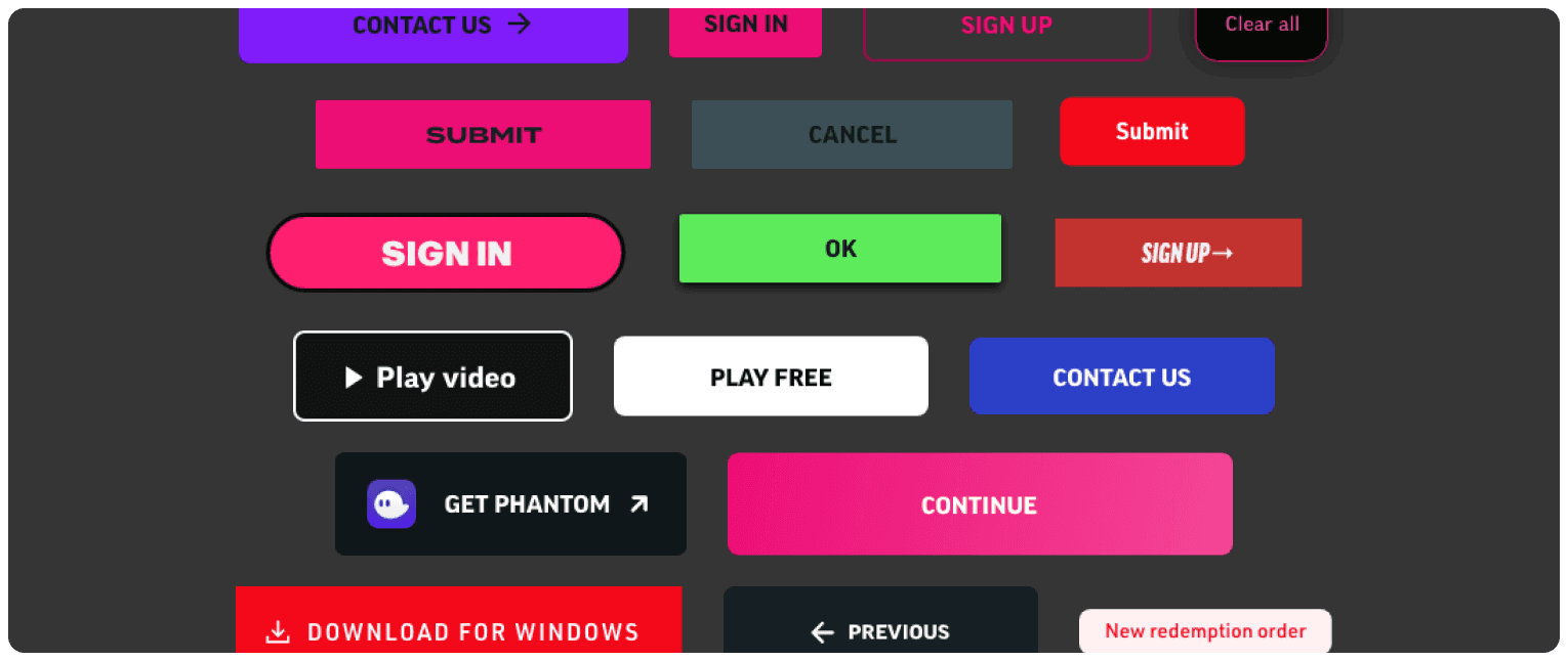
Design debt: a sample of the many conflicting and disjointed button styles we had used just within a single website.
There were 15+ button variants, none of them coordinated. No token documentation. After every handoff, devs had to constantly ping for clarifications on hex codes, spacings, and font sizes. The final result was inconsistent at best, requiring multiple QA cycles before the build matched the design.
The cost of not having a system was clear. We needed to unify everything before moving forward.
Typically, teams in this position build a design system from scratch — full audit, define tokens, build a Figma library, write documentation, slowly test and ship a React component library with Storybook, then hand off to devs. Months of work.
I argued against it. For our team, our stack, our workflow, we just didn’t need it.
Don’t have a design system? You’ll get endless rounds of QA and a mountain of documentation work, creating useless overhead that slows down business cycles and annoys all the team members.
shadcn covered ~90% of our needs out of the box. The remaining 10% could be filled with customizations and extensions — so why spend months rebuilding primitives when we’d get them in days?
The accessibility baked into shadcn’s Radix primitives gave us WCAG compliance for free: focus traps, keyboard navigation, ARIA states, screen reader announcements. Building those ourselves would have added weeks and introduced bugs we’d spend months fixing.
Additionally, a custom design system has to be taught — to new designers, new devs, and increasingly, to LLMs. You’d have to build a custom MCP, write prompting documentation, and maintain it as the system evolved.
Every modern LLM already knows shadcn and Tailwind. For AI prototyping and handoff, that turned a multi-week onboarding curve into zero friction.
Many designers instinctively reach for Inter when in need of a good-looking, functional default. But if you want a functional, readable default, you should pick Noto.
Grotesques such as Helvetica or Inter look good, but the monotony and uniformity of glyph shapes means it’s less readable than humanist fonts such as Noto.
Of course Inter’s main credit is its engineering, with its sophisticated hinting making it look good at small UI sizes. But Noto’s engineering is just as sophisticated, if not more. On top of that, it supports 7× more languages, and 162+ writing systems.
If you’re picking Inter over Noto, it’s because of vibes and preference, not for any readability or functionality reasons.
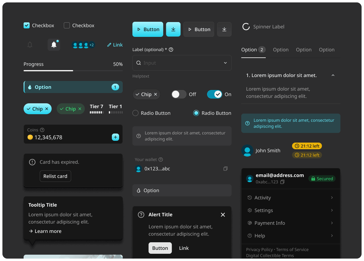
A sample of the components and blocks we built for this new design system.
First, match Tailwind tokens to Figma variables — either build them in Figma directly or import from an existing paid library.
My recommendation: start from a paid Figma template that already has Tailwind tokens wired up. It cuts hours of tedious setup and lets the team focus on the actual design work.
Within a single day, designers can be shipping branded hi-fi screens with all tokens and specs in a format devs can build directly from.
shadcndesign
Up-to-date Figma kit with customizable tokens and built in Tailwind variables.
Figma
Everyone already knows how to use it and there’s so many useful integrations and plugins.
Claude Code
Connect it to the Figma MCP to generate frontend code.
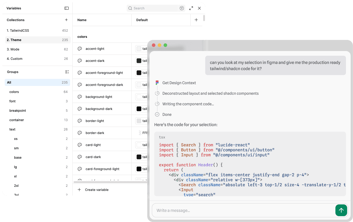
This Figma kit comes with components that are built and structured to be easily understandable to AI. In some cases handoff can be done with just a single Figma tool call with any agentic coding harness.
The team shipped branded UI in days instead of months. WCAG 2.1 AA came for free, language support widened to a global audience, and dev cycles ran faster from day one.
